
I build websites for small businesses, and florists are some of my favorite clients to work with. The work is visual, the stakes are emotional, and the buyer is often a bride making one of the biggest purchases of her life on a tight timeline.
When we built the site for Blosm, an Atlanta wedding florist with over ten years and 2,500 weddings behind them, the project forced me to get specific about what a florist’s website actually has to accomplish. Pretty photos alone don’t do it, and neither does a template.
Here’s what I learned, and what you can take from it for your own site.
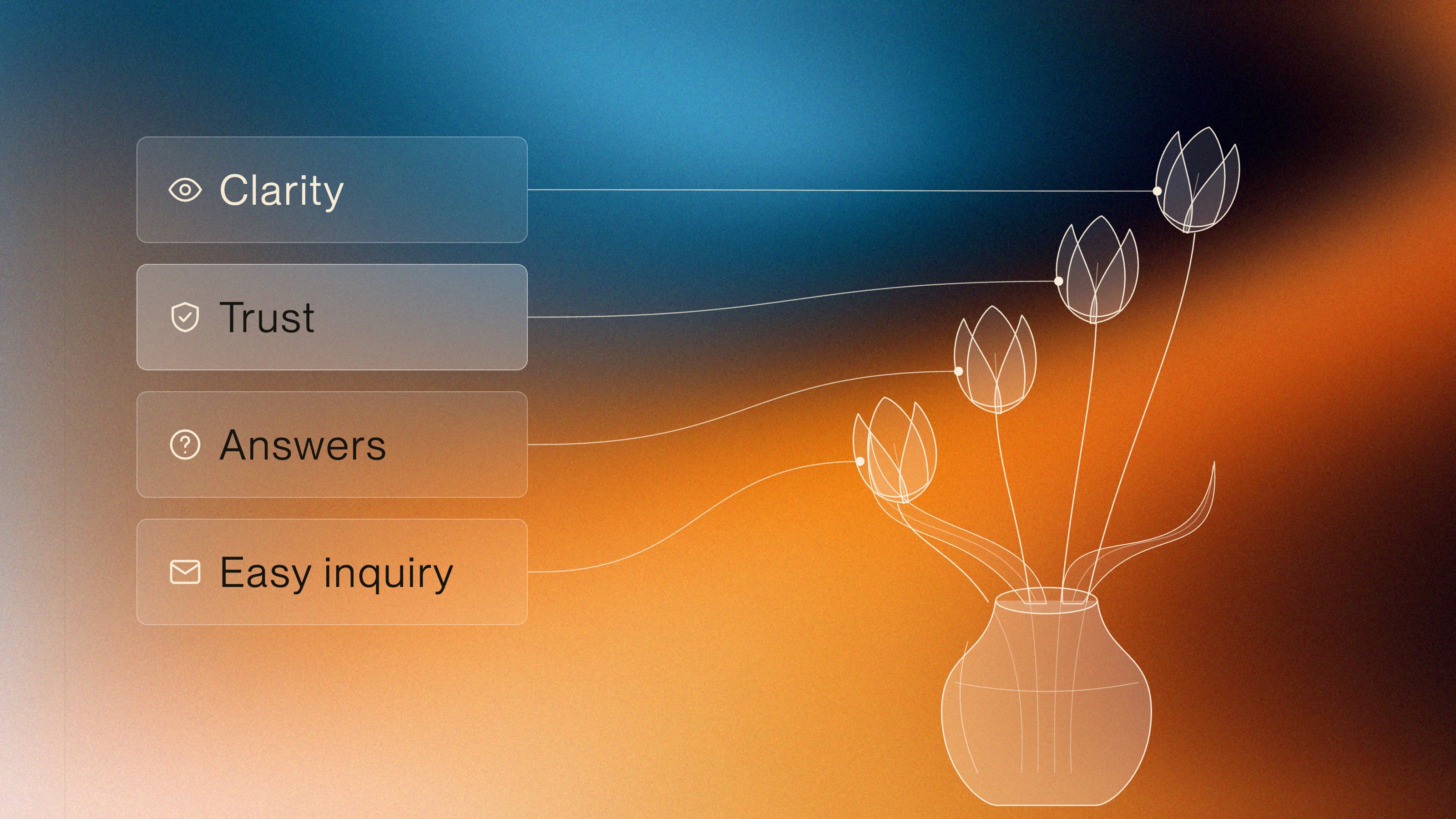
A florist’s website has a sequence of jobs, and the order matters. First, clarity. Within seconds, a visitor needs to know what you offer and who you are. Blosm’s homepage leads with “Atlanta Wedding Florist,” so a bride searching in Atlanta knows right away she’s in the right place.
Second, trust. You establish it with images that prove you know what you’re doing, and with social proof like client reviews. Blosm leans on a decade of experience and 2,500 weddings delivered. Those numbers tell a bride Blosm has done this many times.
Third, answers. An FAQ, a clear description of what’s included in your services, pricing context where you can give it. A bride and a planner both arrive with questions. Answer them before they have to ask.
Fourth, an easy path to reach out. Blosm uses a simple embedded HoneyBook form that isn’t trying to qualify a lead with fifteen questions before anyone says hello.
That sequence mirrors how a real decision gets made. The Knot’s own data points the same way: 65% of couples searching The Knot and WeddingWire look to reviews while planning, and couples find reviews more helpful when a vendor has at least five from the last two years.
What Brides Worry About When They Land on Your Site
Every design decision gets easier once you name what the visitor is actually worried about. For most brides landing on a florist’s site, the worry is simple: can this vendor deliver my vibe, my dream, my vision?
Your site either answers that fast or she leaves. Blosm answers it with the headline, then backs it up with years of experience, the wedding count, and strong reviews woven through the site. The reviews live on the homepage and throughout the pages, so a bride finds reassurance on whatever page she’s reading.
Northwestern’s Spiegel Research Center found that purchase likelihood peaks for products rated between 4.2 and 4.5 stars, and that a perfect five reads as too good to be true. That was consumer products, not florists, but the instinct carries over: a long, mostly glowing review history signals experience and consistency. Future clients read a strong review history as proof you’ve delivered quality many times, not once.
Why Florist Galleries Go Stale
For a florist, the portfolio does heavy lifting. And the biggest portfolio problem has nothing to do with design. Floral trends move fast. A bride looking at florals from three years ago can be seeing a very different aesthetic from what’s happening now. If your gallery is stale, your site tells every visitor that your work is stale too, even when you’re busier than ever.
The reason galleries go stale is operational. If updating the gallery is technically difficult, the owner rarely finds time to do it. It becomes a roadblock. I’ve watched this happen with florists and photographers alike. The update that’s hard to do is the update that doesn’t get done.
So we removed the barrier entirely for Blosm. They upload new images to a Google Drive folder, and we take it from there. We added MarkUp so they can point directly at the exact image on the exact page that needs to change, instead of writing an email describing “the third photo in the second row.” That removes a lot of back-and-forth, and it means the gallery actually gets updated.
💡 My rule of thumb: keep your gallery to a set of your best pieces and swap out your weakest images every quarter.
Put Clear Copy Before Clever Copy
The mistake I see most on florist sites is clever copy ahead of clear copy, and features ahead of what the customer is actually worried about.
The site gets written for the florist’s own taste instead of the bride’s anxiety. The homepage leads with something poetic or vague, and the visitor has to work to figure out what the business actually does.
Microsoft Clarity documents an agency that simplified a client’s confusing page and turned stalled interest into 40 consultation bookings over four months. You can still have personality. You should have personality. Just put clarity first and let the personality live inside it.
Figure Out Who You Are First
The most surprising part of the Blosm project came out of discovery, before we designed anything. Their previous name, branding, and site appealed to a different bride than the one they actually served. The business had evolved. The brand hadn’t kept up.
So we did the strategy work. We dug into who their ideal customer really was and how to portray Blosm for who they were and what they offered. The insight that helped most was that the brand strongly resonated with a particular actress who has a clear, well-defined public persona. It gave us a shortcut to a whole set of decisions.
A florist who is funny and lighthearted occupies a very different brand position from a florist who is refined and proper, or one who is traditional and whimsical. Knowing that personality clearly informs everything:
- Tone of voice in your copy
- Which images make the cut and which don’t
- Font choices and overall visual feel
When the work is done well, a stranger lands on the site and feels who you are before reading a single word.
How to Apply This to Your Own Florist Site
You don’t need my agency to apply this. If you’re building or fixing your own florist site, here’s the process I’d advise.
1. Run a real strategy session with yourself
Sit down and think honestly about your brand, your competitors, and your customer’s point of view. Write it down. This is the foundation everything else sits on.
2. Get an outside opinion
Ask trusted friends or past clients to react to your choices. You are too close to your own business to see what a stranger sees in the first three seconds. In my experience this step gets skipped, and it’s the one that catches the blind spots.
3. Lead with plain clarity
Put your city, your specialty and your experience on the first screen. Save the poetry for deeper in the site.
4. Make your proof easy to find
Put reviews on the homepage and through the pages, and keep your strongest, most current work in a curated gallery that’s easy to skim.
5. Remove friction from your own updates
Whatever system you use, make adding new photos nearly effortless. If it takes more than a few minutes, you’ll probably stop doing it, and your site starts aging the day it launches.
6. Keep the inquiry form simple
Name, date, a little context, submit. Get them in the door and have the real conversation yourself.
The Site Keeps Evolving
New problems keep showing up, and your site has to respond to them. Blosm now sees brides arriving with AI-generated inspiration images: flowers that don’t exist, visions that don’t match budgets. The site predates that problem, so we’re figuring out the answer as we go. For now, an article on the site touches on it, which educates brides without putting a warning label on the homepage.
That’s the right posture for any business site. Treat it as a living thing that adapts as your market changes, built on a performant foundation that makes rapid updates easy instead of painful.
The work that matters most happens before design starts. Figure out who you are. Really figure it out. Then figure out who your ideal customer is. Then build the site that connects those two. Everything else, the images, the fonts, the copy, flows from that clarity.
If you want help running that discovery for your own business, that’s exactly the work we do at Bope Design. Reach out and let’s talk about what your site should be doing for you.